
Responsive Website
Appointment Scheduler
This project is a responsive website that will be embedded into the customers' websites. It is an easy way for dealer customers to quickly scheduler service for their vehicle.
Client /
myKaarma
Role /
Product Designer
Team /
1 PM, 2 Designers, 4 Engineers, 1 Product Marketing Manager
Status /
V1 will be released April 2022
OVERVIEW
Where the story began...
There has been an influx of dealerships canceling or deferring their contract due to the pandemic. How do we remain competitive and prove that we provide more value to our customers than what they're paying?
The appointment-making platform is complex and confusing since there are low completion rates and an increase in phone calls to the dealership. In addition, appointment-related information is inputted in the incorrect place.
RESEARCH
Let's check what we have so far...
To understand the problems of the current scheduler, I started doing the following:
-
Gathered Google Analytics data
-
Conducted a heuristic evaluation using the Nielson's Heuristics guidelines
-
Performed a competitive analysis
-
Interviewed potential customers
Google Analytics - Checking drop-off rates...
The first thing I wanted to check is the drop-off rates, where it is occurring, and why. I analyzed data over the span of 6 months, focusing on 2 weeks segments at a time. I made a chart on the right. Based on the data, I found that:
-
34.2% (~3,848 users) exit after getting onto the login screen
-
32.3% (~3,629 users) exit on the first page
-
14.9% (~1,674 users) exit before they can select a date/time
-
4% (~450 users) exit right before completing the appointment

The 4% drop-off rate was interesting to me because the users made it all the way to the end of the flow and decided to exit. This indicates to me that there is some major flaw in the design.
Heuristic Evaluation - Seeing it for myself...
The next thing I wanted to do is to check out the issue for myself. I tried to book an oil change service appointment through our platform. Using Nielson's Heuristics as a guide, I found the following violations:
Login/Landing Page
Violation of Rule: #8 Aesthetic and Minimalist Design
There are 4 ways to start scheduling an appointment:
-
New guest
-
New guest with vehicle selection
-
Returning guest information search tool
-
Returning guest with username and password


Service Selection
Violation of Rule: #2 Match Between System and the Real World
The wording used on this page was difficult for customers to understand. The description under each service is also cut off and difficult to read. In addition, not all services are listed. A user must remember dealership terminology and be able to search for the service.
Date/Time Selection
Violation of Rule: #9 Help Users Recognize, Diagnose, and Recover from Errors
The "Your Vehicle Info" and "Notes" section are required items, but are not clearly marked. After a user clicks "Next" without filling out the information, an error message pops up all the way at the top, making it difficult for the user to even be aware of the error.


Date/Time Confirmation
Violation of Rule: #1 Visibility of System Status
If a user wants to edit something, they would have to scroll down and click the "Back" button all the way until they reach the correct page. In addition, a user is required to create an account at the end, which can be off-putting.
Competitive Analysis - What are our competitors doing...
After identifying issues in our current implementation, I was curious to see what additional features are offered by our competitors and how we compare against them.

User Interviews - Talking to those who feel the pain...
Conducting user interviews was a hard task because we had to go gather users. I started reaching out to dealerships, asking permission to reach out to their customers to ask them a few questions about their experience. I was able to interview and gather feedback from 12 customers. I found that the interviews reinforced our previous findings. Some quotes from the interviews are below:
"I usually call in because I don't understand what the services mean on their website and it's just faster."
"I tried booking an appointment online once before, but I never remember the password to my account."
"I prefer to schedule appointments online, but I tried submitting an appointment a few times and nothing happens."
IDEATION
Synthesizing my findings...
After gathering my data, it is time to put it all together and make some sense into my findings. I started by defining feature prioritization and fine-tuning the user flow.
After my initial finding and feature prioritization, I needed to draft a better, more simplistic user flow that solved all our heuristic violations and user concerns.
Current User Flow
I have outlined the pages on the right with the highest drop-off rates that we had discussed before. How do I help make these screens easier for users?

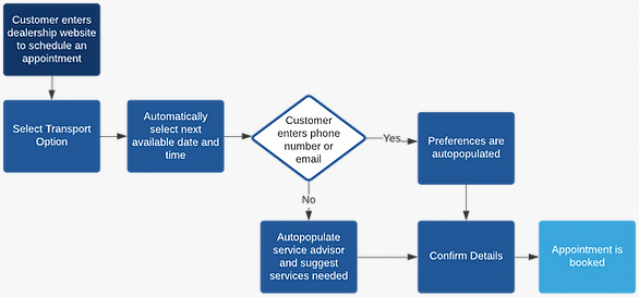
Updated User Flow
I reduced the flow to require the minimum amount of information to book an appointment.
Feature Prioritization - Finding out what is and is not needed...
After identifying the flow and all features offered by other competitors, I used the Moscow Method to identify what should be included in our MVP and what could wait for a future release.

DESIGN AND DELIVERY
Putting everything together...
After consolidating all my research, I started drafting some initial sketches to better define the flow by conducting additional user testing to hopefully validate my design decisions.

After showing my sketches to many users and key stakeholders, I reorganized the flow and some interactions. After many iterations, I ended up with an MVP below. This prototype is ready to test be released. In the next phase, I will begin to A/B test this new flow with the older version to check completion rate.

